☰
Having a mobile website is crucial since there are more than 280.54 million users in the United States, which is more than 70% of the entire population, making the need to develop and design a mobile-optimized website obvious. A mobile-friendly website allows users to easily reserve a room through a hotel's website. These questions will be answered in this blog.
With the changing era of digitalization, users often browse mobile websites rather than desktops. According to research by comScore, In December 2013, U. S. hit 65.2% of smartphones, and within three years of duration, around 99% of shifts increased in the number of smartphones produced. In another research conducted by comScore in March 2015, 11.3% of users chose to operate data on mobile websites.
Smartphone penetration is increasing rapidly in The United States. Many countries are also seeing even more rapid growth in smartphone penetration. Many third-world countries demonstrate more smartphone penetration than even PCs per household. Smartphones are rapidly becoming the computing device attracting the highest electronics usage worldwide.
A recent statistic by Techjury discovered that mobile generated 54.25% of traffic across the US compared to desktop, which was only 42.9%. The statistic also concluded that every adult in the US spends at least 4 hours on a mobile device a day. The rapid growth in users has lifted the shift of browsing the internet on mobile rather than on a computer.
Let’s dig deeper into the process of how a mobile website for a hotel is unique compared to a computer website.
In simple terms, a mobile website is a smaller version of a desktop website.
Graphics play a huge role in a mobile website, as it is the first element a user is attracted to when visiting the site. The content should be precise and crisp to the point where the information is simplified. The site shouldn’t delay the time it takes to load, which might affect the productivity of quickly generating traffic.
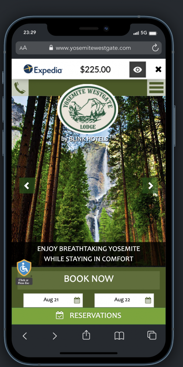
All mobile-friendly websites will function according to these features mentioned above. Here’s an example of what a mobile website should look like:

Image Source: Yosemite Westgate Website
Just like a property blueprint, a mobile website design should also have specific patterns to function regularly for better traffic and productivity. Of course, all prints are different from each other with particular uniqueness.
However, there are mainly two mobile website patterns that travelers often feel drawn toward, viz., the F and Z patterns.
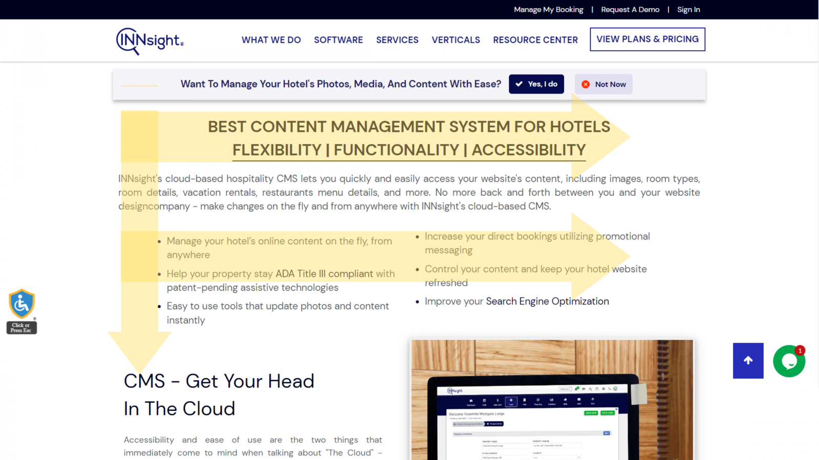
The F pattern primarily focuses on the content driving part of a site, whereas the Z pattern focuses on the visual side.

Image Source: INNsight
Each pattern varies according to the different features, e.g., the F pattern attracts users through its titles and subtitles.
On the other hand, the Z pattern often draws a user through the visuals, pictures, videos, and graphics present on the website.
.png)
Image Source: INNsight
The Z pattern follows a layout, which flows through titles, then the visuals, and later back to the subtitles present on the website.
All websites have certain elements or attributes which help organize and regulate the website more efficiently.
These various characteristics vary and function according to websites and the hotel.
In addition, the engagement of the hotel plays a significant role in how the website will appear and function.
Apart from these moderating factors, a few common factors also play an essential role in the effectiveness of a hotel's mobile website.
When creating a mobile website for a hotel, a few factors such as the outflow, appearance, and modification are kept in mind to improve the site’s performance.
Here are some pointers to take into consideration:

Your website’s template is a significant factor that displays the website’s basic functionality.
A site needs to have a concrete structure and format.
It also needs a basic flow and outline of each section.
A particular size and dimension decide the precise structure of the website.
Each website will have a different layout according to your priority.

The first thing to remember while designing the mobile website is that the content or data of information needs to be short and to the point.
Try condensing your information and focusing on your niche and the unique value you provide to your guests.
For example, create a short paragraph and use simple phrases or catchy taglines to gain more attraction from the audience.
The content is as simplified as possible, and the language needs to be understandable by a layman.
You can shorten the content into smaller paragraphs that leave a clean appearance on the website and are convenient enough for readers to read and understand the content.

Use infographics to bring a dynamic look to the content you mention on the website.
Graphics can create a vibrant look to the website and improve the organic reach of audiences on your website.
When you use visuals such as images, infographics, and videos, the audience stays engaged and is most likely to spend time digesting your content.
In addition, images and videos can also be informative for the audience.

Any website should have a proper outline of the sections provided.
A navigation tool allows your guests to easily find the information they want and will in return keep them engaged on your website.
Make sure your navigation tool is user-friendly with enough space between the sections and a fast load speed.
A viewer always tends to open multiple tables to check all information at once, so when designing a navigation tool, try to ensure that you keep the fonts of the section a bit larger and provide an accurate pace for the device to function.

A website requires a CTA (call to action) element for engaging with the audience, and it creates conversion rates for the business.
Similarly, a CTA button on a hotel website helps the user reach your hotel or reservation procedure.
Make sure the CTA isn’t lengthy or difficult to make the audience understand the process.
The button should be quick and fast-paced enough to conduct the action.
The conversion rates will increase if the procedure is short and simplified.
Note: According to Google, almost 60% of smartphone or mobile users directly approach the hotel or business through CTA.
Apart from the primary and mandatory factors to be considered, minute elements get eliminated while designing a mobile website for a hotel.
Some of the factors do create a significant disturbance in the overall performance of a mobile hotel website. In contrast, sometimes, it affects the overall percentage of organic reach and target audience.
So, let’s get to know some factors you need to consider while designing a mobile website for a hotel.

The main agenda of a mobile website is the formatting of the content.
In addition, one needs to ensure that the content is shortened and contextual according to the website.
Furnish the content you want to upload on the site by adding it from a user’s perspective. Then, reframe and generate the content size, keeping the user’s viewpoint and mindset in your head.
Adding more pages to your hotel website will lower the website’s performance.
But, according to research by TripAdvisor, a miscellaneous page such as Things-to-do brings about 28.6% organic traffic to the website.

The user needs a proper way or access to connect to the hotel or the hotel’s reception.
Try to add a suitable address or contact number to the website.
One can also add a different page for the information of the hotel.
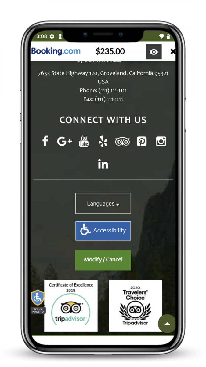
Try including the various ways to contact the hotel, such as email address, contact number, and hotel accounts on different social media.
Adding the hotel’s complete address is also essential for the customer to verify and locate the hotel according to their understanding.

A hotel website can easily attract users through local SEO, which can target an audience based on the city and state.
One can also include and mention the local business found in the area near the hotel.
These businesses generate a source of the organic audience, which helps you in the long run.

Image Source: Yosemite Westgate Website
The most important thing about uploading or adding images on the site is that you ensure that the definition or resolution of the images or videos doesn’t have a huge weightage.
All videos on the mobile hotel website should compress in a limited time, and the pace should be proportional to the site’s load time.
The different weightage of images acceptable or convenient for a website vary according to the image format—for example, 46% JPEG and 28% PNG. One can also add an image in GIF format with a weightage of 23%.
Note: Videos of hotel property in 3D virtuality help the customer get a good look at the hotel in street view. With the Threshold facility, you can achieve this task within precise load time and timed pace suitable for your site.

The many icons present on a site occupy the prominent space during the load time and density of the website.
One must ensure that each icon or the image of the icons must fit in a specific dimension and resolution.
Take extra care regarding the visibility and appearance of the icons, as these will be the first thing the audience gets attracted to or views initially on the site.
A mobile website consumes significant space for loading at the site at a particular time.
The load time varies according to the site, pages included, and elements used in designing the page, e.g., images and videos.

The above statistic is a report by Google about conversion rates from mobile websites.
One should ensure that the elements you use for designing the website have a fast pace for the load time to be accurate.
The images and videos you use on the site have the most weight for the load time to be diverse.

In the new era of digitalization and marketing, a responsive website can be seen as the innovation of mobile websites.
A responsive website is compatible with any desktop, laptop, tablet, or mobile device.
It also easily adjusts according to the screen size of the visitor, so the content displayed on the site is suitable for the user’s device.
Unlike any mobile website, a responsive website initiates a high scope of SEO through optimizing a website in various areas such as overall performance, layout, and attracting traffic.
As Google has advanced its ranking and listing strategies, responsive websites have a greater chance of ranking and positioning in the top list of Google.
Moreover, it is pretty evident that Google efficiently optimizes a responsive website for its fluent load time and other factors in recent times.
The various factors that create a significant role in having a beneficial SEO for a responsive website are as follows:
1. Usability of the Website
No matter how amazing your website appears to be, if the user finds it difficult to navigate or browse through the website, the website is of no use at all.
When a responsive website is generated, the first step is to organize the user usability for the website.
Next, the user should find it easy to navigate and locate the data, which is flexible for usage.
A responsive website takes all measures to have a positive experience.
The user’s positive experience builds a better experience for the ranking on Google listing.
A better user experience advances the possibility of reaching a good position.
One can experience good usability, which provides an increased number of visitors and conversions.
People have now learned how a responsive website brings impressions that cater to a scope of profitable revenues.
2. Load Time
A responsive website is the ultimate solution if you want to adapt to a faster-paced website.
Moreover, the flexibility of the website gradually enables a better user experience.
Recently, Google has also initiated how user experience now plays a significant role in listing positions.
3. Bounce Rate
No more worrying about the interrupting user experience, which leads to a downfall in bounce rate.
A responsive website supports the user experience that indicates the flexibility of the design of a website.
4. Content
A responsive website easily reflects on the accuracy of duplicate content.
A mobile responsive website guarantees the proficiency of the content for all measures.
5. Profitable
One of the long-run goals of a responsive website is the benefit of saving money and time.
Creating a responsive website helps you secure your time by not providing two different website sources, i.e., desktop and laptop.
The flexibility of the responsive website saves a lot of penny at your end and enriches the role of SEO in the play.
Eventually, this higher scope of SEO helps you reserve any cost required for PPC advertising.
6. Social Marketing
Even though the fact remains unknown whether SEO increases the chance of enhancing social reach, a few benefits that influence a responsive website to land on a social media platform remains unknown.
A responsive website helps you easier the process of social sharing as it adequately fits into the guidelines of Facebook and Google. In addition, these social shares generate a base for automated advertising for mobile.
All the benefits draw a clear picture about how the 360 view of the responsive website enables faster and rapid growth for digital marketing and your business.
A mobile hotel website needs consistency in design and load time for the overall performance.
Make sure the content present on the site isn’t congested or cluttered with too much information or data.
When designing your site, always keep your target audience in mind. Always remember the importance of CTAs to entice users and turn them into paying guests.
The experts at INNsight can build your hotel a custom responsive website with crisp content and white hat SEO strategies to increase the growth of your website on Google listings.
Alongside, we additionally provide a feature of ADA-compliant resources to operate your website with complete fluency and protection.
So join the massive team of professionals to make your website and digital marketing more flexible and profitable.
 Related Blogs
If you want our team to help you achieve your marketing goals and drive more direct revenue, contact us today!
By submitting your email address, you confirm that you would like to receive marketing emails from INNsight. In addition, you agree to the storing and processing your data by INNsight as described in our privacy policy.

